scratchpad.media

virtual trading card effects in css, html, and javascript
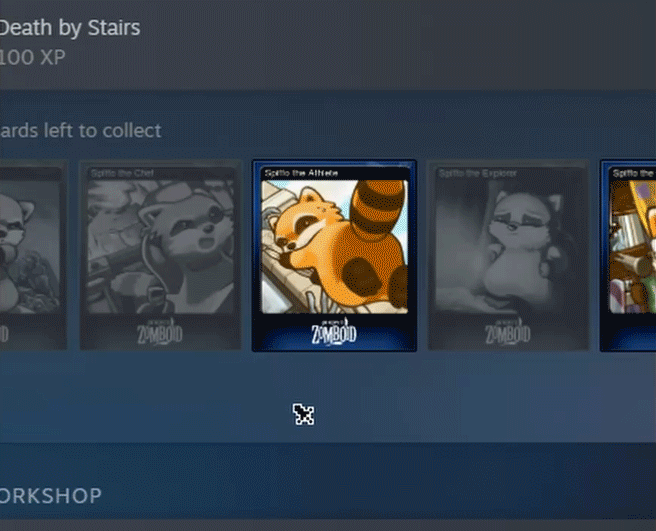
Valve's Steam platform has an interesting effect for its digital trading cards that adds a bit of skeumorphic flair to an otherwise entirely intangible object:
I'm not entirely certain what framework Valve uses for the GUI of the Steam application, but I was able to find a few methods recreating the effect with a mix of HTML, CSS, and JS, though none were quite close enough to what I was imagining. This implementation (archived) by Tinos Psomodakis achieves the effect rather elegantly with fairly minimal code.
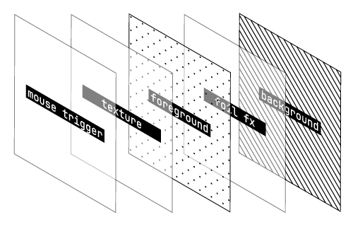
The linked example does a thorough of job explaining the method, but here's a recap: the basic idea is to set up a div as a "trigger" or "mouse tracker" to capture to the X and Y coordinates of the mouse cursor. The trigger is invisible and set at a high Z-index so that it always remains above all other elements. In the example below, the constructed card is comprised of two simple layers for the foreground and background. However, the principle is the same regardless of the number of individual components "behind" the trigger.
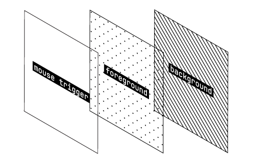
One of the key takeaways from the above source is to make sure that the mouse tracker div remains static even when the foreground and background content is transformed. If it isn't, the transform function activitated on mouseover will cause the mouse tracker div to move in and out of the mouseover state, resulting in a flickering effect.
The real magic, however, is in the mathematical formulas used to derive the transform values for the X axis, Y axis, and degree of rotation used by the rotate3D() CSS property.
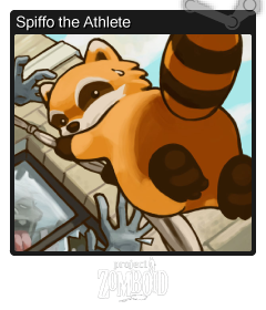
A scaleFactor is defined as a global variable and used to determine how large the card becomes on mouseover. Next, rotationValue is set as a modifier of this scaling to determine how far the card should "push away" from the mouse cursor as it reaches the corners. For reference, the scaleFactor and rotationValue of the example cards on this page are 1.5 and 10, respectively.
Some of the examples I found went so far as to actually set up a point light with more advanced Javascript, but this isn't really necessary; it's possible to achieve a similar effect more simply by using filter: brightness() with a luminosity value derived from the Y-position of the mouse.
At this point, we're basically done:

BUT, there's still some more we can do.
In the physical world, a crucial part of the trading card experience is the rarity of certain cards over others, represented in some cases by decorative metallic inks that add shine and cachet. When I started this project, I wanted to find a way to simulate and incorporate the "foil card" style into my version of the Steam card hover effect. Steam itself does have rarer variants of its trading cards, but as far as I'm aware these variants only differ in terms of background color and potentially foreground art. Where's the fun in that?
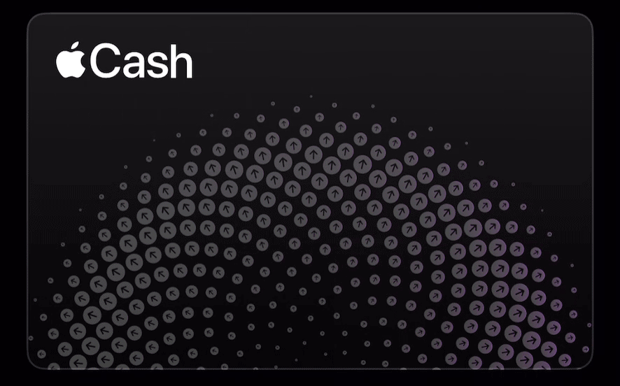
I drew inspiration from Apple Cash card availabe in the iOS Wallet app. This card has a shiny effect that uses the phone's gyroscope to respond to changes in the phones orientation, allowing it to "catch the light" just like a real card would:
To recreate this effect, I had to get a little creative. The approach I came up with was to create a div as another layer that contains a gradient, and then shift that gradient left or right depending on the X-position of the cursor (essentially, the inverse of the highlight effect applied to the X-axis).
To get this to work properly, I had to scale the gradient to 200% its normal size, and then offset its start position by -50%. In order to avoid seams, I also had to set the start and end colors of the gradient to the same color, since it ultimately wraps around on itself.
Real trading cards are made of papers and card stocks that become creased over time. To add this character to my digital cards, I found a great set of old playing card backs that had been scanned as high-quality PNGs that proved to be great for adding a little wear-and-tear using the mix-blend-mode: screen CSS property. The total div stack now looks as follows:
All put together:
Because the order of the layers is flexible, you can easily rearrange which elements appear above or below the foil shine, or even simulate more complicated foil printing using carefully-placed foreground transparency. For example, many sports trading cards feature embossed elements with foil paper applied---why not spice that up by highlighting those parts of our virtual trading cards with the same treatment?
Breaking the card into several layers allows for a lot more flexibility in how the cards appear. Is there a better way to do this? Maybe. I didn't know any Javacsript and I barely knew any HTML or CSS before I started this project, so I'm pretty happy with the results.